

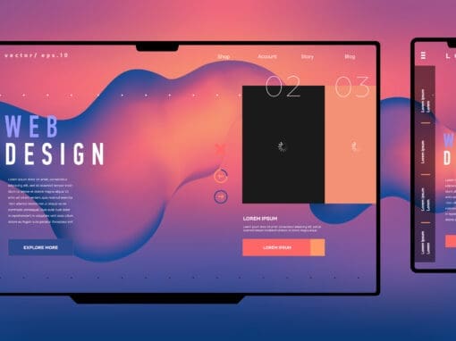



Most people now browse the web on their phones first. If your website is not built to work well on mobile, you are probably losing visitors before they ever get a chance to contact you.
A mobile-friendly website makes it easy for people to read, navigate, and take action on any device. That means a better user experience, greater trust, and more opportunities to convert visits into leads.
Why Mobile Matters
A website that looks good on desktop but breaks down on a phone is a problem. Visitors should not have to pinch, zoom, or fight with tiny buttons to find basic information.
Google also pays attention to mobile performance so that a mobile-friendly site can boost your search visibility. If your site works smoothly on a phone, it is more likely to perform well for both users and search engines.
What Makes a Site Mobile Friendly
A strong mobile site is simple, responsive, and easy to use. Text should be readable without zooming, menus should be easy to tap, and pages should load quickly.
Forms, buttons, and contact links should also work properly on smaller screens. If people can get where they need to go without friction, they are more likely to stay on your site and take action.
Why It Helps Your Business
A mobile-friendly website can improve everything from engagement to conversions. When visitors have a better experience, they are more likely to contact you, book a service, or make a purchase.
It also makes your business look more professional. In a competitive market, that extra polish can make a real difference.
Build for Mobile First
At JEM Digital, we build websites with mobile users in mind from the start. That means making sure your site looks great, works properly, and supports your goals on every screen size.
If your website is not mobile-friendly yet, it may be costing you business. A better mobile experience can help you get more from the traffic you already have.